ShopDreamUp AI ArtDreamUp

Deviation Actions
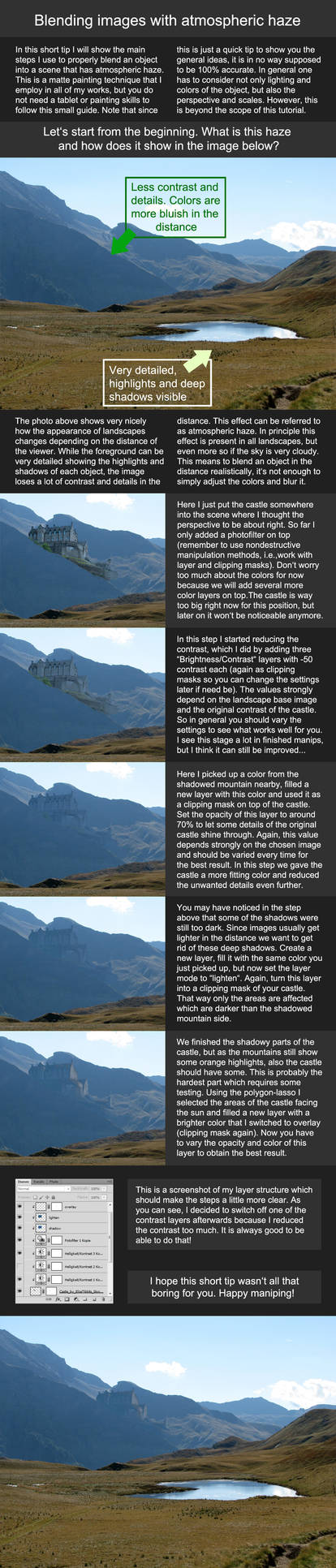


Description
For SlashTHREE: Le Cirque Des Couleurs
My last deviation before I go to Louisiana for three months. (Smile)")
Steps:

Stock credits:
Model: *DyingBeautyStock

~ashlee7307-stock
=xNickixstockx
wings: [link]
sxc.hu: [link] | [link] | [link] | [link]
Other stuff is either my own material or painted.
© Erik Schumacher
This is no stock image, so don't use, copy or manipulate the original artwork without my written permission.
Visit my website: [link]
My last deviation before I go to Louisiana for three months.
Steps:
Stock credits:
Model: *DyingBeautyStock
~ashlee7307-stock
=xNickixstockx
wings: [link]
sxc.hu: [link] | [link] | [link] | [link]
Other stuff is either my own material or painted.
© Erik Schumacher
This is no stock image, so don't use, copy or manipulate the original artwork without my written permission.
Visit my website: [link]
Image size
699x1000px 889.26 KB
© 2010 - 2024 ErikShoemaker
Comments66
Join the community to add your comment. Already a deviant? Log In
after looking at it for a while I decided to critique <img src="e.deviantart.net/emoticons/s/s…" width="15" height="15" alt="
Ich versuchs gut zu erklären <img src="e.deviantart.net/emoticons/r/r…" width="15" height="15" alt="
for me it feels to overloaded ..too many textures at once at some parts wich makes me have no focus point in this artwork. The focus could be her head and face though the deep purple colour seems weird too me the arm is lighted and shaded nice (colours) the face seems too dark and looses the focus cause of it's strong hue.
I must say I really like the down part, the dress. the colours and the textures work there. the "wings" seem a bit too much for the whole composition. the hair is blended in nicely.
overall it just seem to be too much.