ShopDreamUp AI ArtDreamUp
Deviation Actions


Description
[link]
I have a few unfinished wips flying around but I'm always running out of ideas. Plus, my account is almost dead, so I'm trying to reanimate it with an older submission which I actually didn't intend to post here. D:
I'm really frustrated lately. University is fine, but I want moooore time to create new works. I have to think of math all the time so there's no room left for creativity.")
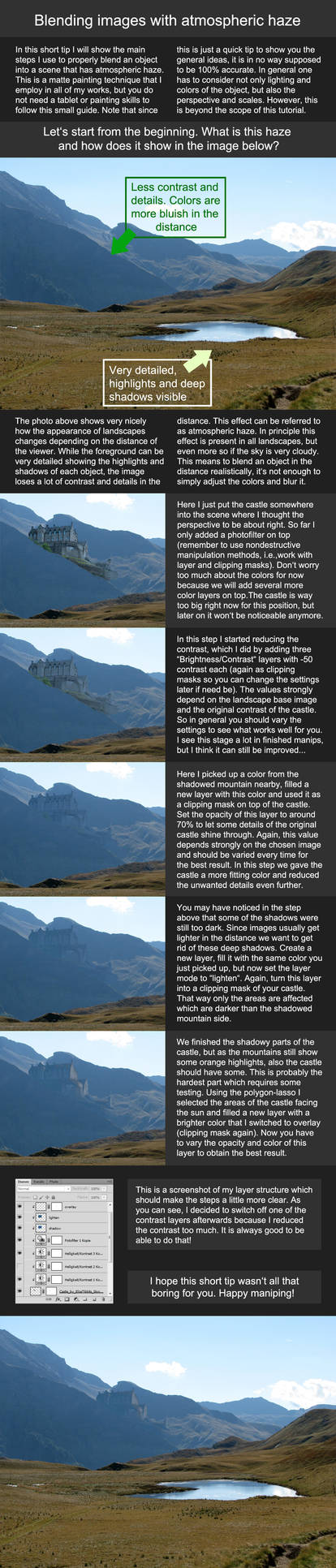
Here's a little step by step image for you to see what I've done: [link]
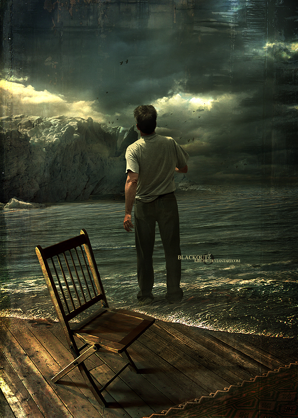
This is a commission for the Band "TheArkitecht". You can find this picture in the cover inlay of their latest release "Hyperstructure". Check out their page! [link]
All resources from morguefile.com and cgtextures.com
© Erik Schumacher for The Arkitecht
This is no stock image, so don't use, copy or manipulate the original artwork without my written permission.
Visit my website: www.xkire.de
![[link]](https://www.deviantart.com/users/outgoing?http://www.hahastop.com/pictures/I_Has_Sad.jpg)
I have a few unfinished wips flying around but I'm always running out of ideas. Plus, my account is almost dead, so I'm trying to reanimate it with an older submission which I actually didn't intend to post here. D:
I'm really frustrated lately. University is fine, but I want moooore time to create new works. I have to think of math all the time so there's no room left for creativity.
Here's a little step by step image for you to see what I've done: [link]
This is a commission for the Band "TheArkitecht". You can find this picture in the cover inlay of their latest release "Hyperstructure". Check out their page! [link]
All resources from morguefile.com and cgtextures.com
© Erik Schumacher for The Arkitecht
This is no stock image, so don't use, copy or manipulate the original artwork without my written permission.
Visit my website: www.xkire.de
Image size
600x840px 599.52 KB
© 2008 - 2024 ErikShoemaker
Comments329
Join the community to add your comment. Already a deviant? Log In
People really thought they have seen everything in Photomanipulation ? Then they should look at Blackout.
Actually this is still my most loved deviation in your gallery. To me it is saying "Something's up" all the time I look at it. This is true whereas you cannot see it and exactly this is crafting this work so high. The surreality itself is unfathomable.
The texture in the upper range suits to the whole picture and it is contributing a special traditional art look which is set perfect to the canvas. I guess the sad thing is it is fading on the right side the more you go to the bottom. It should come into sharper relief then it would be more looking like a frame.
Colours. While we're on colours, I think you did the best job ever on colours in this work, I am totally in love with them. The only thing that is disturbing me is the overcontrasted part on the right side among that man.
The left side fits with its' lighting and quality, however if you look on the right side the water is going very dark blue at a point and so it does not look really nice.
Speaking of that dark blue area in the water, you should change this colour since the whole area around it has a smooth blue with the reflecting shine.
But keep up the work. I hope in future we all can see more of your transcendent works just like this.
Greetz
161